Bubble Chart Template for PowerPoint & Google Slides
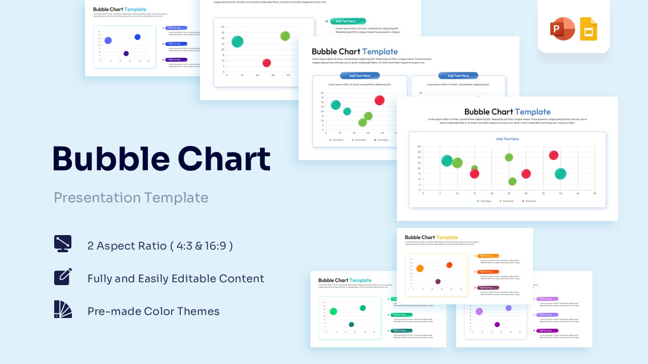
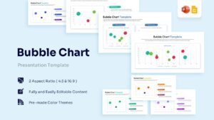

Professional Data Visualization Slides for Strategic Analysis
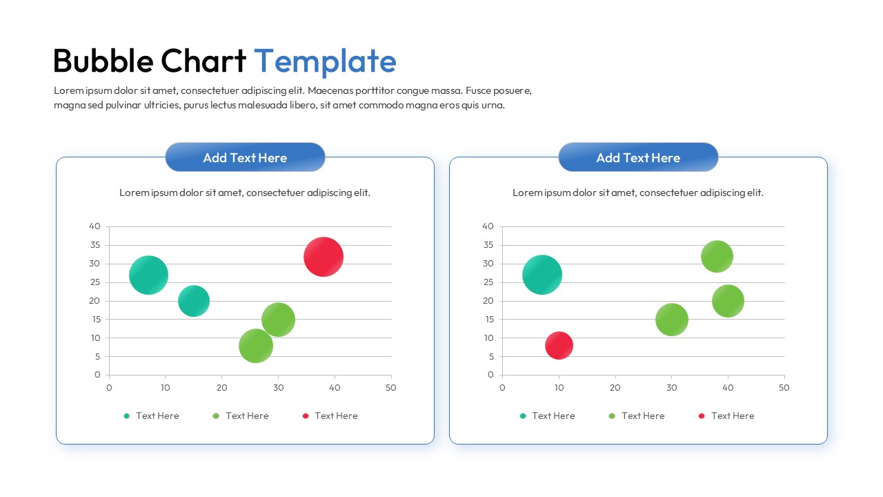
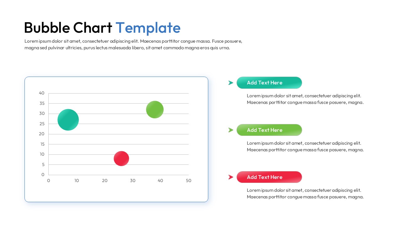
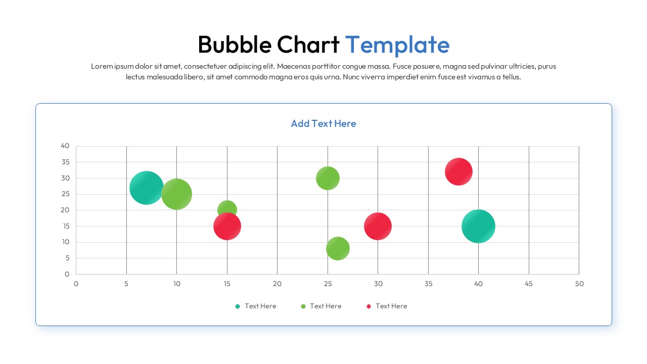
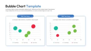
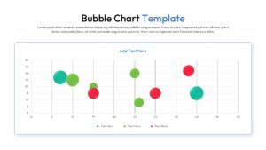
Download this Bubble Chart Template and use case for identifying market gaps, analyzing product portfolios, or mapping customer segments. This versatile interactive data visualization slides allows you to represent three variables simultaneously using horizontal and vertical axes alongside varying circle sizes. The clean, modern aesthetic ensures your high-level data remains the central focus of any corporate presentation.
Visualizing complex relationships becomes effortless with this scatter plot infographic, which translates raw numbers into an intuitive spatial map. These bubble chart diagrams are perfect for comparing R&D projects by cost, risk, and potential ROI, or for evaluating sales performance across different regions. By utilizing a secondary keyword variation, this presentation layout helps stakeholders quickly grasp which data points are outliers and which represent significant growth trends.
Every element within this visual framework is built using high-quality shapes, allowing you to resize and recolor components without losing clarity. You can easily integrate these customizable statistical infographic slides into your existing deck to maintain brand consistency while presenting sophisticated metrics. This slide deck is engineered for flexibility, enabling users to adjust the $X$ and $Y$ coordinates and bubble diameters to reflect real-time business intelligence with minimal effort.
Why Use these Bubble Chart Template – Metric Comparison Layout
- Provides a multi-dimensional view of data to reveal hidden correlations and trends.
- Simplifies the communication of complex statistics through intuitive size-based scaling.
- Reduces design time with pre-configured grid systems and labeled data point markers.
- Maintains professional visual standards with a balanced, high-contrast color palette.
Who Should Download this Scatter Plot Infographic – Data Visualization Slides
- Data analysts and financial controllers tracking market fluctuations and investment risks.
- Project managers evaluating portfolio health based on budget, time, and impact.
- Marketing strategists mapping brand positioning against competitors across multiple axes.
- Educators and researchers presenting scientific findings or demographic distributions.
Key Features
- 100% Vector-Based Graphics
- Fully Layered & Organized
- Multi-Platform Support
- Theme Color & Theme Font
- Adjustable bubble sizes and positions
- Clean coordinate grid for precise value mapping
Frequently Asked Questions
- Can I change the size of individual bubbles in this scatter bubble diagram?
- Yes, every bubble is an independent vector shape. You can click on any circle and drag the corner handles to change its size to reflect your specific data values.
- How many data categories can I represent in this metric visualization layout?
- While the default slides show three to four categories using different colors, you can easily duplicate or delete bubbles to match the number of data series in your report.
- Is the coordinate grid editable in these multivariate data slides?
- Absolutely. You can modify the axis labels, change the scale increments, and adjust the grid lines using the standard shape and text tools in PowerPoint or Google Slides.
Related Templates
-
 Free
Free -
 $3.99
$3.99 -
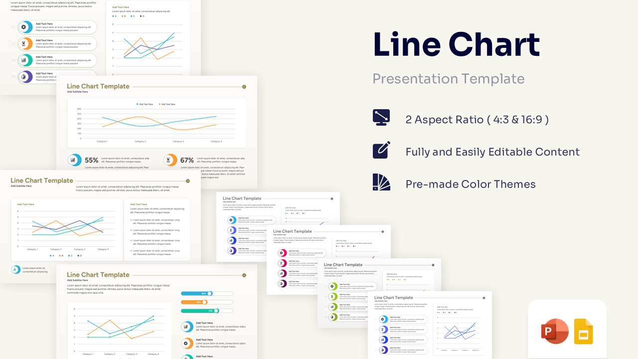
Professional Line Chart Template for PowerPoint & Google Slides
Charts & Graphs
$3.99 -
 $4.99
$4.99