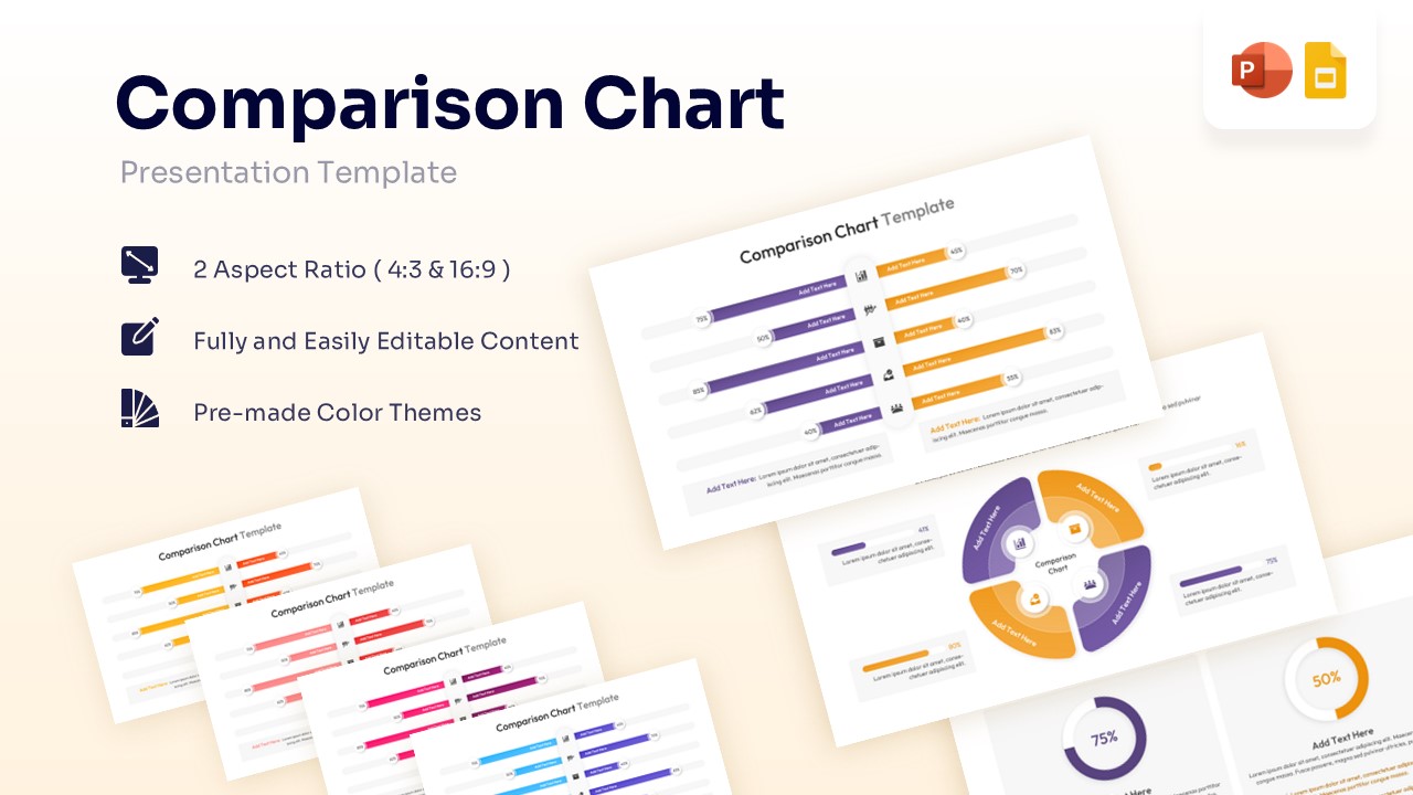
Comparison Chart Template for PowerPoint & Google Slides


Data Comparison Presentation Template
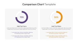
Download this Comparison Chart to show the difference between two sets of data clearly. Whether you are comparing this year’s sales to last year’s or looking at product features, this charts and graphs template helps you make your point quickly. It is fully ready for PowerPoint and Google Slides, so you can download it and start working right away without worrying about formatting issues.
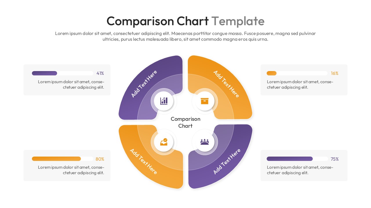
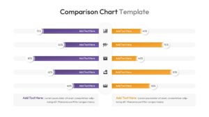
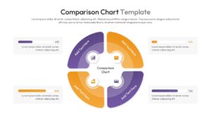
This Comparison Chart Diagram features clean, modern layouts including a butterfly bar chart and circular diagrams. The central axis design allows you to place icons and labels neatly, while the horizontal bars give a clear visual of the percentages. The default purple and orange color theme creates a strong contrast, making the data easy to read, but you can easily change the colors to match your own brand guidelines.
These slides are perfect for business presentations where you need to show growth, decline, or direct comparisons. You can use them for financial reports, marketing performance reviews, or customer satisfaction surveys. They also work well for competitor analysis to show where your company stands against others in the market, helping stakeholders make informed decisions faster.
Why Use this Comparison Chart Diagram
- Makes complex data comparisons easy to understand at a glance.
- Saves you time on design so you can focus on the content.
- Helps you answer audience questions quickly with clear visuals.
- Keeps your presentation looking professional and organized.
Who Should Download Comparison Chart Template
- Sales Managers needing to track and compare team performance.
- Marketing Professionals comparing campaign results or demographics.
- Business Analysts presenting quarterly data and financial stats.
- Project Managers showing progress against specific goals.
Key Features
- 100% Editable and Easy to Modify
- Includes Horizontal Mirror Charts and Donut Charts
- Pre-made Purple and Orange Color Theme
- Vector-Based Icons for Clarity
- 2 Aspect Ratios (4:3 & 16:9)
Frequently Asked Questions
- Can I change the data percentages easily?
- Yes, all shapes and text boxes are fully editable. You can adjust the length of the bars and the text numbers to match your specific data.
- Is this template compatible with Google Slides?
- Yes, this template works perfectly with both Microsoft PowerPoint and Google Slides.
- Can I replace the icons?
- Absolutely. The icons are vector-based, meaning you can swap them out, resize them, or recolor them without losing quality.
Related Templates
-
-
-
 $2.99
$2.99 -
 $4.99
$4.99