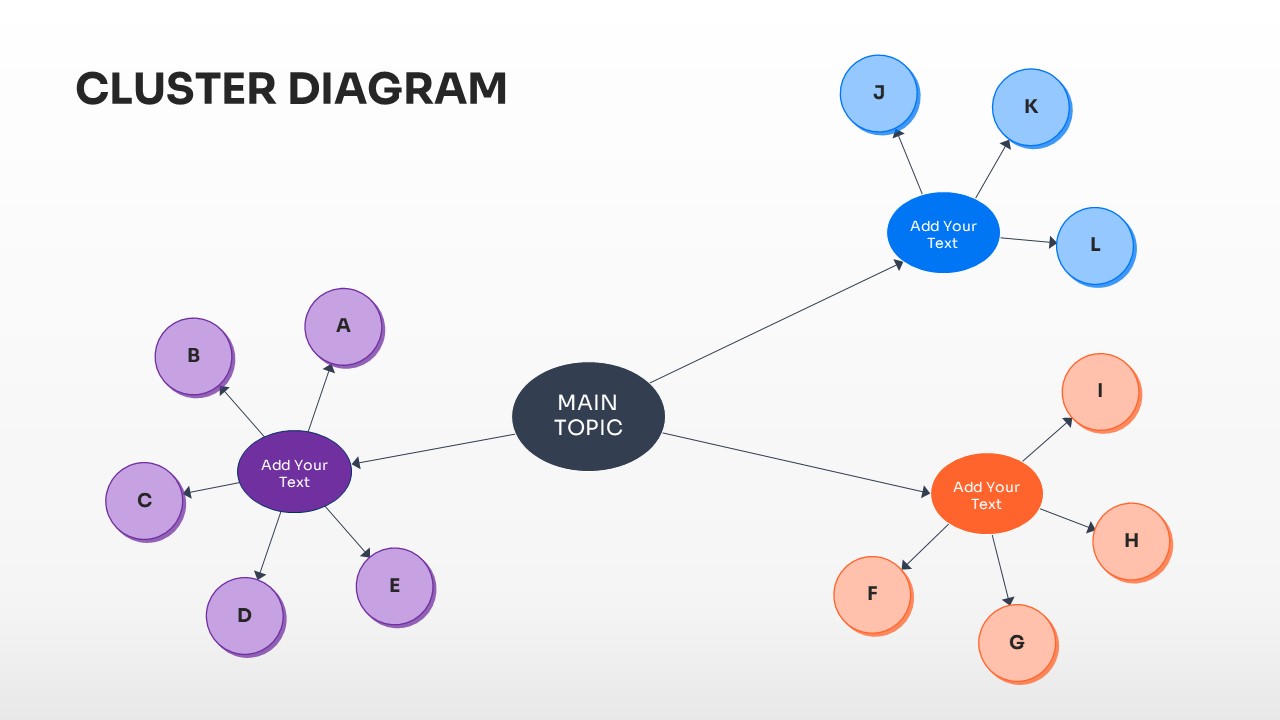
This slide demonstrates a multi-tier network structure where a main topic branches into three distinct sub-groups, each with its own set of points. The use of blue, purple, and orange highlights helps differentiate between different data categories. It is ideal for complex project mapping or departmental breakdowns.