Scatter Chart Visualization Infographic Template for PowerPoint & Google Slides
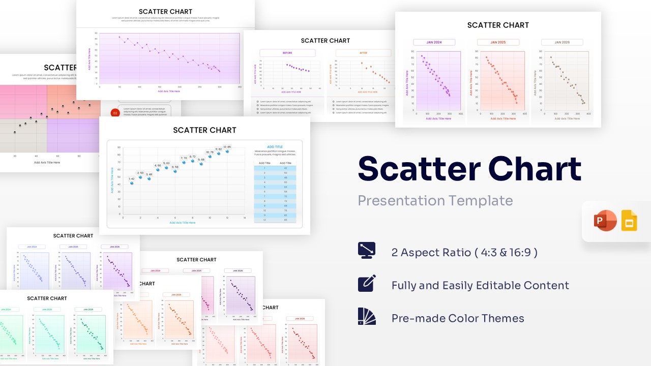

Scatterplot Chart Presentation Template
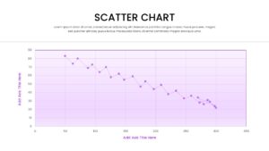
Download this Scatter Chart Template to transform complex datasets into clear, visual stories that help your audience grasp correlations instantly. Whether you are tracking market trends, scientific results, or business performance, these editable chart templates provide a structured way to display the relationship between two variables. Designed for clarity, this template ensures that your data points stand out against professional backgrounds, making it easier to identify clusters, outliers, and patterns during important briefings.
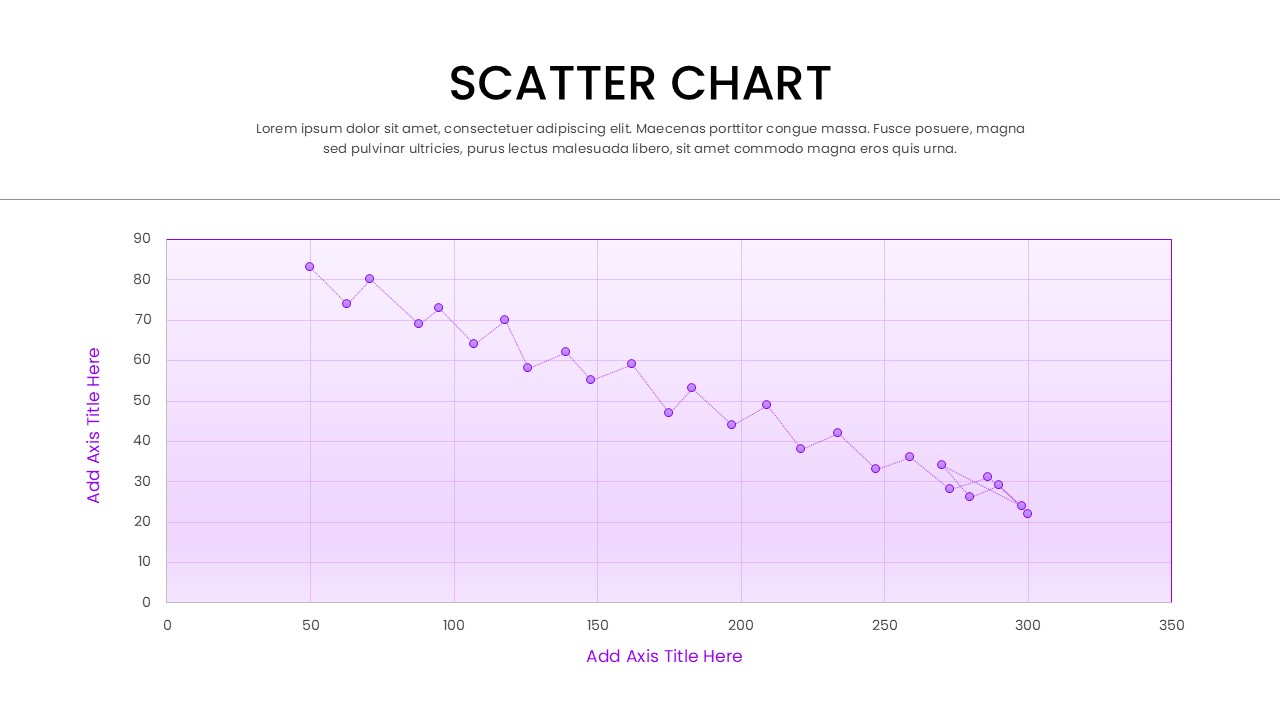
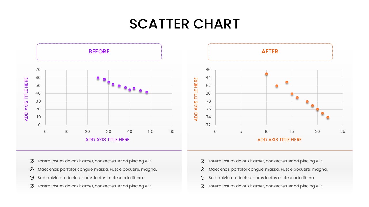
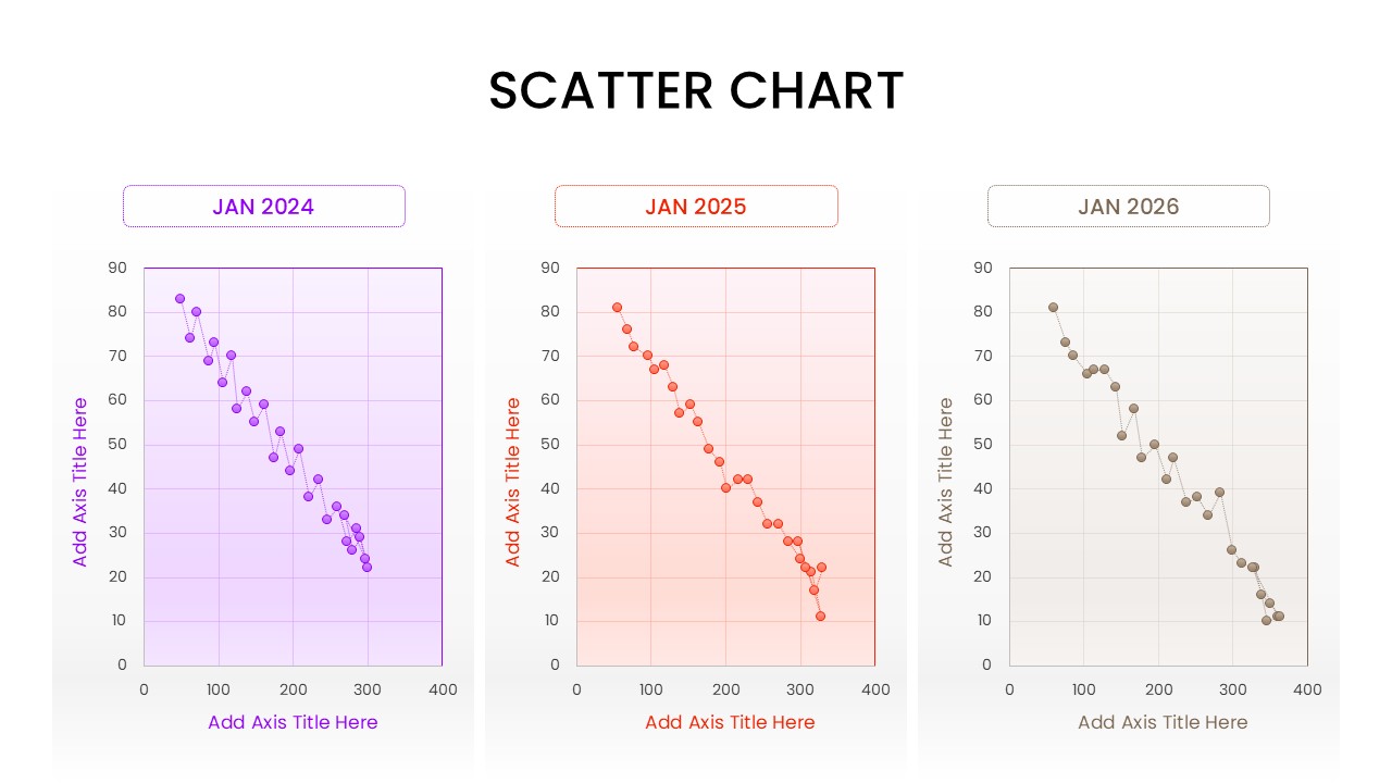
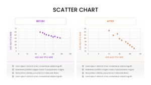
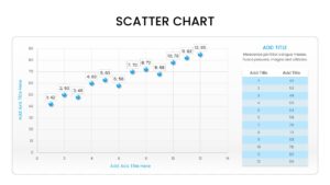
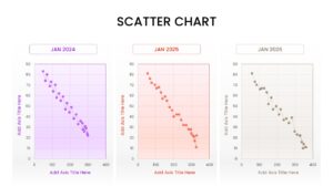
This versatile collection of scatterplot chart features multiple layouts, including single large-scale plots, “Before and After” comparisons, and multi-chart grids for year-over-year analysis. Each Scatter Plot Infographic is built with ease of use in mind, allowing you to adjust data points, axes, and labels without needing advanced design skills. The clean, modern aesthetic ensures your presentation looks polished and authoritative, helping you move from raw data to actionable insights in minutes.
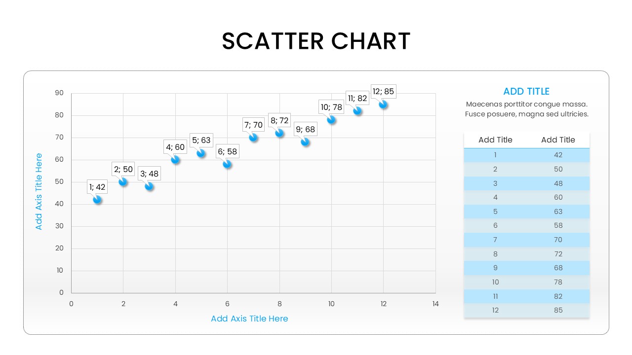
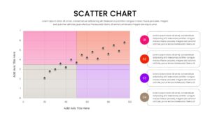
These chart and graph templates are perfect for various use cases such as performance tracking, correlation studies, and trend forecasting. By using a Data Visualization Scatter Chart, you can effectively communicate the “why” behind the numbers. The inclusion of callout bubbles and data tables alongside the graphs allows for a deeper dive into specific metrics, ensuring that no detail is overlooked while maintaining a high-level overview for executive summaries.
Why Use this Scatter Graph Diagram
- Displays Correlation and Distribution patterns with professional precision.
- Facilitates Trend Analysis through clear, chronological scatter plot layouts.
- Enhances Data Comparison using specialized “Before and After” comparison slides.
- Provides Actionable Insights by combining charts with detailed data tables and callouts.
Who Should Download this Scatterplot Chart Templa
- Financial Consultants performing risk assessments and stock market fluctuations.
- Project Leaders monitoring resource allocation and task completion status.
- Educators teaching statistical concepts or displaying classroom performance data.
- Sales Teams visualizing lead conversion rates and revenue growth patterns.
Key Features
- 100% Vector-Based Graphics
- Fully Layered & Organized
- Multi-Platform Support
- Theme Color & Theme Font
Frequently Asked Questions
- How do I edit the data points in this scatter chart?
- You can easily edit the points by selecting the graphic and using the built-in PowerPoint or Google Slides shape tools to reposition or add new dots.
- Can I change the color scheme of the charts?
- Yes, the template uses theme colors, so changing the global presentation theme will automatically update the chart colors, or you can manually edit individual elements.
- Is this template compatible with both 4:3 and 16:9 ratios?
- Absolutely. The download includes versions optimized for both standard and widescreen formats to suit any projector or screen.
Related Templates
-
Project Budget Template for PowerPoint & Google Slides
Annual Report
$3.99 -
 $3.99
$3.99 -
 Free
Free -
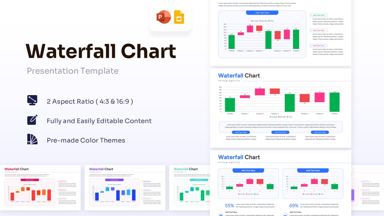
Waterfall Chart Template for PowerPoint & Google Slides
Bar and Column
$3.99