Waterfall Chart Template for PowerPoint & Google Slides

Professional Financial Bridge Chart Presentation Template
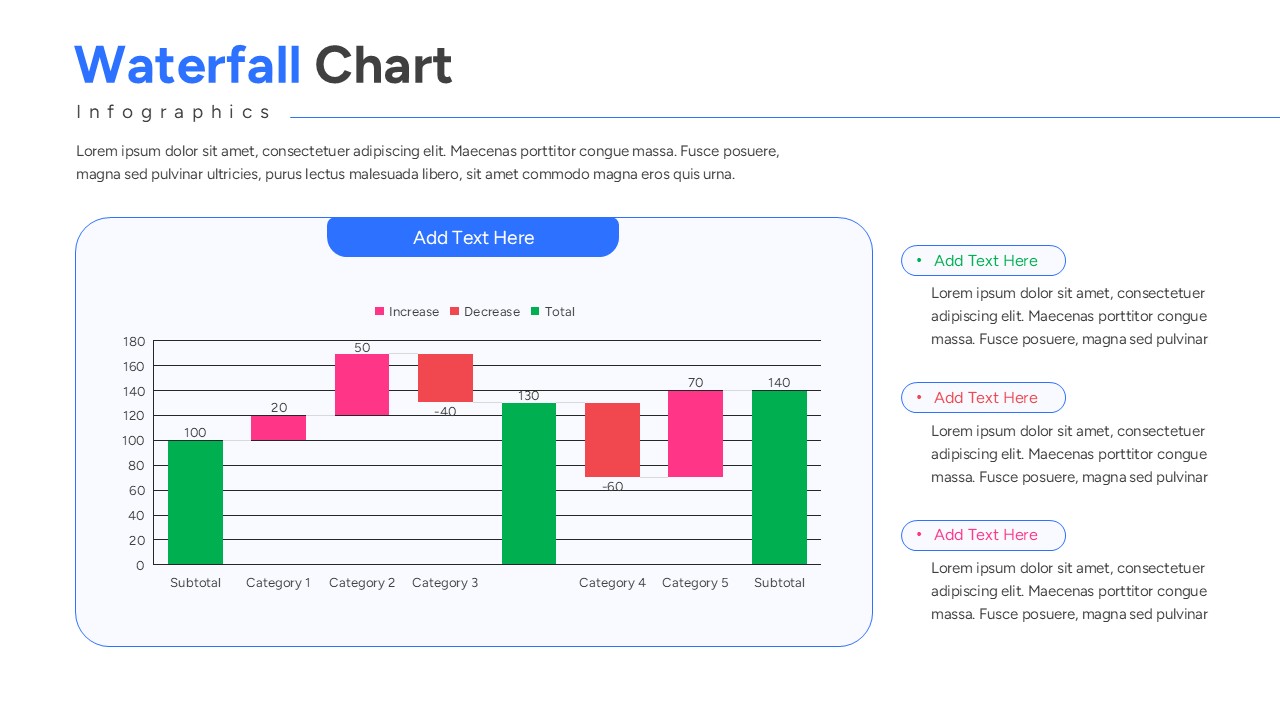
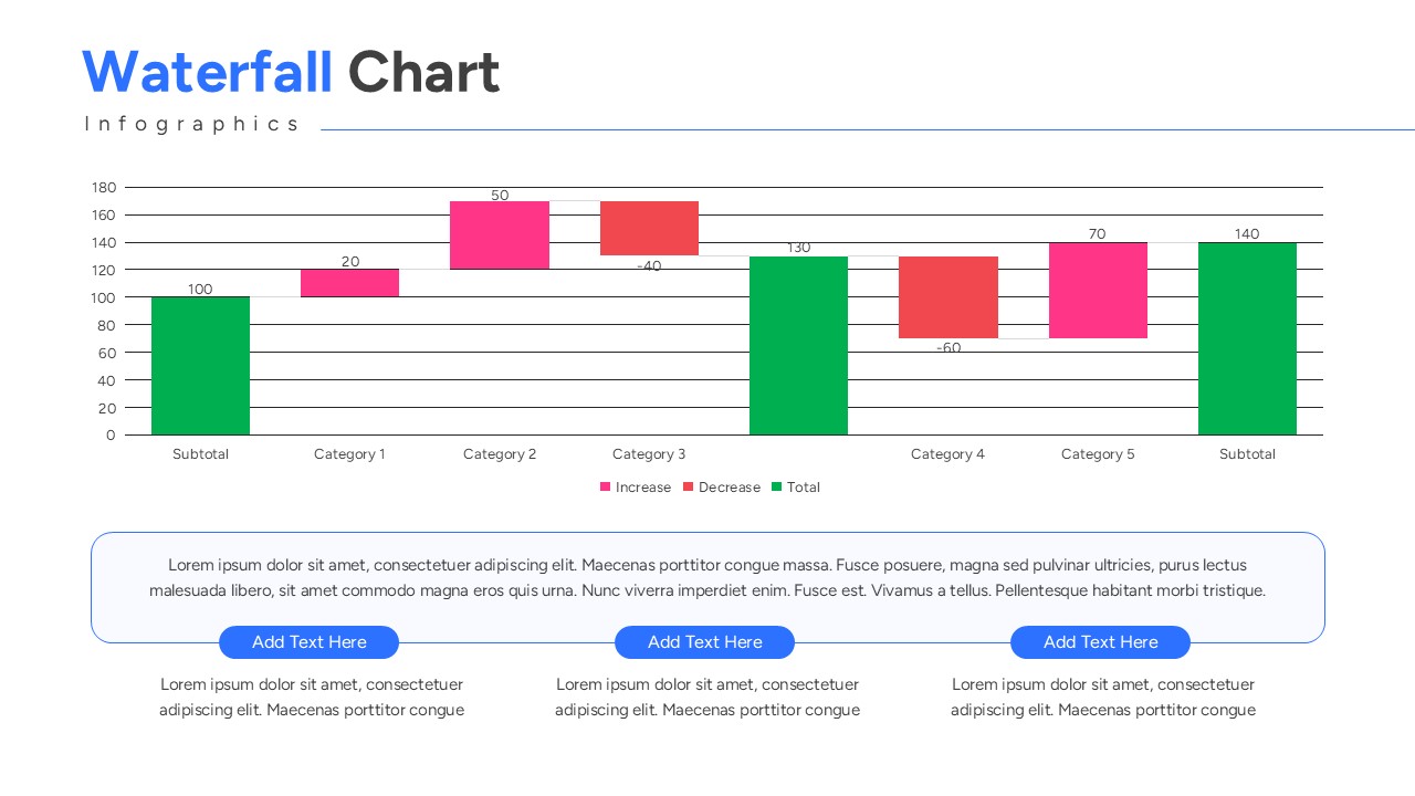
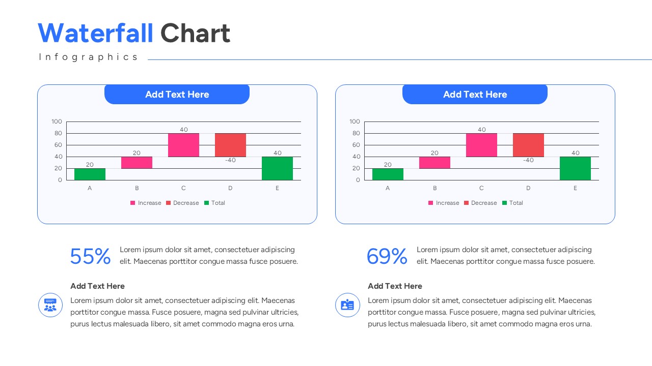
Download this Waterfall Chart Template and show your stakeholders exactly how your data moves from point A to point B. These Bar & Column Chart Templates are perfect for illustrating how an initial value is affected by a series of intermediate positive or negative values. Whether you are explaining budget variances, revenue growth, or inventory changes, these slides help you present complex financial bridges with total confidence and professional clarity.
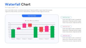
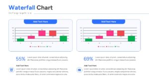
This Waterfall Chart Template features a variety of clean, data-driven layouts designed to make your reporting faster and more effective. By use charts & graph templates like bridge analysis diagrams and financial deviation charts, we have ensured this deck covers every analytical need. Each slide uses a logical flow that guides the audience’s eye through every increment and decrement, ensuring that even the most dense financial data feels approachable and easy to digest.
In a professional setting, these Waterfall Chart templates serve as a versatile asset for various departments. Finance teams can use them for year-over-year profit analysis, while HR departments might track headcount fluctuations. Project managers find them invaluable for showing resource allocation or task completion flows. Because the graphics are fully vector-based, you can scale every element without losing quality, making your deck look polished on any screen size, from a laptop to a boardroom projector.
Who Should Download this Waterfall Charts
- Financial Analysts and Accountants needing to present variance reports or budget reconciliations.
- Sales Directors visualizing the components of revenue growth or customer churn.
- Operations Managers tracking supply chain changes, inventory levels, or logistics flows.
- Consultants and Executives preparing high-stakes briefings for board meetings or investor updates.
- Strategic Planners mapping out milestone progress and resource shifts over a fiscal period.
Why Use this Waterfall Chart Infographic
- Clear Bridge Analysis: Use this Waterfall Chart Template to explain the “why” behind your final numbers.
- Impactful Data Visuals: High-contrast bars help your audience immediately distinguish between growth and decline.
- Rapid Customization: Update values, colors, and text in seconds to fit your specific reporting period.
- Polished Aesthetic: Maintain a consistent, high-end corporate look that saves you hours of manual formatting.
Key Features
- 100% Vector-Based Graphics
- Fully Layered & Organized
- Multi-Platform Support
- Theme Color & Theme Font
Frequently Asked Questions
- Can I change the colors for positive and negative values?
- Yes, the bars are fully editable shapes; you can easily apply your brand colors for increases and decreases.
- Does this work with my existing deck?
- Absolutely. These slides are designed to be copied and pasted into any existing presentation while maintaining theme consistency.
- Is there a limit to how many categories I can add?
- The layout is flexible, allowing you to add or remove bars to match the number of data steps in your specific analysis.
Related Templates
-
 $3.99
$3.99 -
 Free
Free -
-